C.A.S.T. Crew Apparel: ANGLER TEE
LOGO DESIGN & MEDIA: C.A.S.T. Crew
This might be the beginning of something BIG!
LOGO DESIGN: Natural Balance 101
CUSTOM KICKS: PINOY PRIDE
The base shoe for this project was a pair of all white Air Max 90s. The customer wanted the pair to reflect her Filipino heritage. I took elements of the Filipino flag and flipped them up a bit. Here is what they looked like...
MUSIC: OPUS mixtape cover
Producers Fanum and Isle of Weight, collectively known as the OPUS, needed a cover for their new compilation "The Opus of the Opus vol. 2." I originally created the volume one cover a while back and used multiple instruments to spell out their name. This time I thought that it would be more cohesive to make one instrument and treat it like a graffiti piece. You have to stare at it a little, but you can see their name spelled out in the brass instrument. A new favorite...
If you are interested in downloading this mixtape you can click here.
LOGO DESIGN: Pipiohpi
Fantasy football has always had a big draw especially when money is involved. One team reached out to me to create a logo and some jerseys to represent themselves. Their team name is "Pipiohpi" taken from a reference from the movie "Forgetting Sarah Marshall". They wanted a Tiki Warrior incorporated into the design and after a few font choices, this is the design that made the cut:
LOGO DESIGN: Kustom Karats
Ryan Howard, owner and fabricator of Kustom Karats linked up with me to create a media push for his custom jewelry business. We started with the logo...
LOGO DESIGN: TOP CHEF TALDE
Chicago native and Top Chef All-Star Dale Talde is making big moves in 2011. He will be opening up a restaurant in New York named TALDE in the near future. I really don't know all of the details, but based on his culinary track record, it should definitely be a place to check out if you are in the area.
When he approached me to create his logo, he wanted it to have a classic/vintage feel while incorporating his filipino heritage. Once we figured out what kind of vintage style he was looking for, the graphic sun element naturally fit into the design. Much success to you Dale! Thanks for the opportunity...
MUSIC: ST!ZO x SONY VAIO EXPO 2011
I was asked to deejay an event at the W Hotel Lakeshore about a month ago. I really didn't know what to expect when I was asked to do it, but I took the gig anyway. I rented some speakers, cleared the schedule and downloaded some radio friendly selections to get ready for what turned out to be the Chicago SONY VAIO Expo 2011. This was a personal milestone for me! I spun for 12 hours straight without repeating one song! Usually I deejay clubs with about 3 hours of material..just in case, but this was like a marathon! Sony was introducing the VAIO Z series amongst other new Sony offerings. The Sony staff was very accommodating and the W hotel was very helpful with the load-in/load-out. At the end of the day, they sent me home with a swag bag and a some mortgage money. Good times!
LOGO DESIGN: DYK Editorial, Inc.
This logo was created for a new media company based in Chicago's South Side. DYK Editorial, Inc.. Headed by Nick Kofski, DYK takes your media projects to the next level with up to date video technology and years of experience to back it up. I have done some freelance for Nick a few years ago when he was with another company, but since then his clientele has grown which led him to branch out on his own.
Silkscreening: G.O.A.T. Tee
This was a production run for a label called Ducking Pigs out of Chicago. The two shirts featured 2 and 3 color logo flips of classic Chicago Cubs logos with the same graphic on the back in one color. They will be available in select streetwear stores and online in a limited run of 36 for each style. Be on the lookout!
LOGO DESIGN: Symplify Event Designs
This logo was created for the Symplify Event Design team. They have been planning quite a few Indian events, but wanted a simple logo that would eventually help them branch out into other markets. Part of their mission statement mentions that they will "bring together all the elements of your event to create a harmonious symphony." With that in mind, I immediately thought of musical symbols. Reversing the treble clef into an "S" seemed to fit perfectly. Glad they liked the direction.
CUSTOM KICKS: BLACK FLAG "Police Story" AF1
This pair of shoes was made for the owner of Beau Monde Shoe Gallery. He wanted to have the infamous "Police Story" album artwork (by Chuck Higby) incorporated into the design as well as the Black Flag logo. Black Flag was considered to be one of the first hardcore punk bands and innovators in the punk scene. This particular album has a special story attached to it. You can read more about it here. Teaser and video below...
MUSIC: RUBBEROOM Promo Designs
Chicago based progressive hip hop group RUBBEROOM contacted me to create a press pic, album cover and other promotional materials for the upcoming launch of their new mixtape "REBOOTED." I hauled my lighting setup out to Oak Park and shot a few group pics. This is the one they chose before and after the digital magic.
LOGO DESIGN: Optimal Design
I had the opportunity to design a logo for a Chicago based industrial design organization called Optimal Design. They asked me to put together a logo for their trademarked 4Di process. After a couple weeks of concepts and tweaking, we agreed upon this final design.
The creation of this logo was accompanied by a launch party for potential and current clients to unveil the science behind the process itself. Here are some pics of their facility that evening...
CD Design: BILLA CAMP
A lot of my design work can be found in the Chicago music scene. I have been designing covers, flyers and various promotional materials for numerous Chicago acts since the late 90s. This one was for Billa Camp an artist from the live hip hop band Treologic. The front and back cover were set up to look like an old record sleeve and the actual CD has the look and feel of a 45 record. The title of his solo project is called "Weird Science" and this was the final product...
Video Shoot: Scott Ian
I jumped into the pit at the House of Blues to shoot video of Randall artist Scott Ian (Anthrax) in the super group the Damned Things. We did a little Q & A before the show talking about his signature model amp that I designed the modules on. Here's the final product hot off the press...
American Songwriter Ad
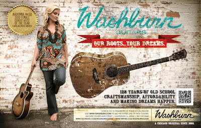
This is the first ad in a campaign to showcase the heritage of the Washburn Guitar brand. I took a press picture of Madonna Nash (Washburn Artist) and placed our logo, tagline and an acoustic from our line in the blank space. I distressed the images to give them an old weathered advertisement feel.
CUSTOM GEAR: ALL NATURAL x UPRISE x ST!ZO collab tee
It's been a while and I have been crazy busy...time to catch up! This project was a t-shirt design for Chicago-based label All Natural, Inc. and Uprise Skateshop. They basically wanted to do a shirt that celebrated their longevity in the game. I sent them a few designs, but they settled on the record and skateboard combo separated by the Chicago stars. It took a couple back and forth emails to get the vintaging on the record and deck correct, but in the end, we were all happy with the outcome.
CUSTOM GEAR: STAR WARS x ST!ZO x EQ BAGS
I looked like an intergalactic pumpkin!
Video Shoot: Solo RM
The latest addition to the FreshMen video series on Rubyhornet.com. I sit down with graffiti artist/ illustrator Solo RM as he tells me about some of his influences and explains the concept behind the comic strip that we work on called "On The Daily". Look out for more from Solo and On The Daily in the near future.
Silkscreening: Turn It UP HIYA!
It has come to my attention that a certain shirt that I created a couple of years ago has made an appearance on Disney's "Shake It Up" program worn by Chicago native, Duncan Tran. The front sports Bruce Lee toting a boombox yelling "Turn It Up HIYA!" On the back is my word logo in a stencil style. I printed only 93 of these shirts in a limited run and destroyed the screen. One of my favorite designs.


